

Price Match Promise
Seen a similar kitchen for cheaper? We’ll match the price.
20% off stone worktops until 11th November* Find out more
A closer look at kitchen colours that live well beyond first impressions.
Published
Trends come and go, but colour is something you live with every day. A well chosen palette should feel calm, comfortable and easy, long after the install dust has settled.
This guide is about buying colours that last, not chasing what looks good on a screen for five minutes.
Colours don’t exist on their own. They sit alongside flooring, furniture, artwork and light that shifts throughout the day. The more naturally a kitchen colour sits within that bigger picture, the more likely it is to stand the test of time.
In open plan spaces especially, colour is what keeps everything feeling connected rather than chopped up. From hallway, to living space, to dining space, to kitchen, colour plays a big role in how smoothly it all flows together.
Timeless kitchens usually start with neutrals, but there’s plenty of nuance within that. Paula Rosa Kitchens focus on a considered palette for exactly this reason. Soft whites, warm greiges, layered greys and muted natural tones appear again and again. That’s not by chance. These door colours are chosen because they sit comfortably with different layouts, lighting conditions and finishes, rather than tying you to a short lived trend.
These calm tones are available in all our ranges. Tap to explore our white and beige colours in our shaker doors and beige and grey in our flat slab ranges.

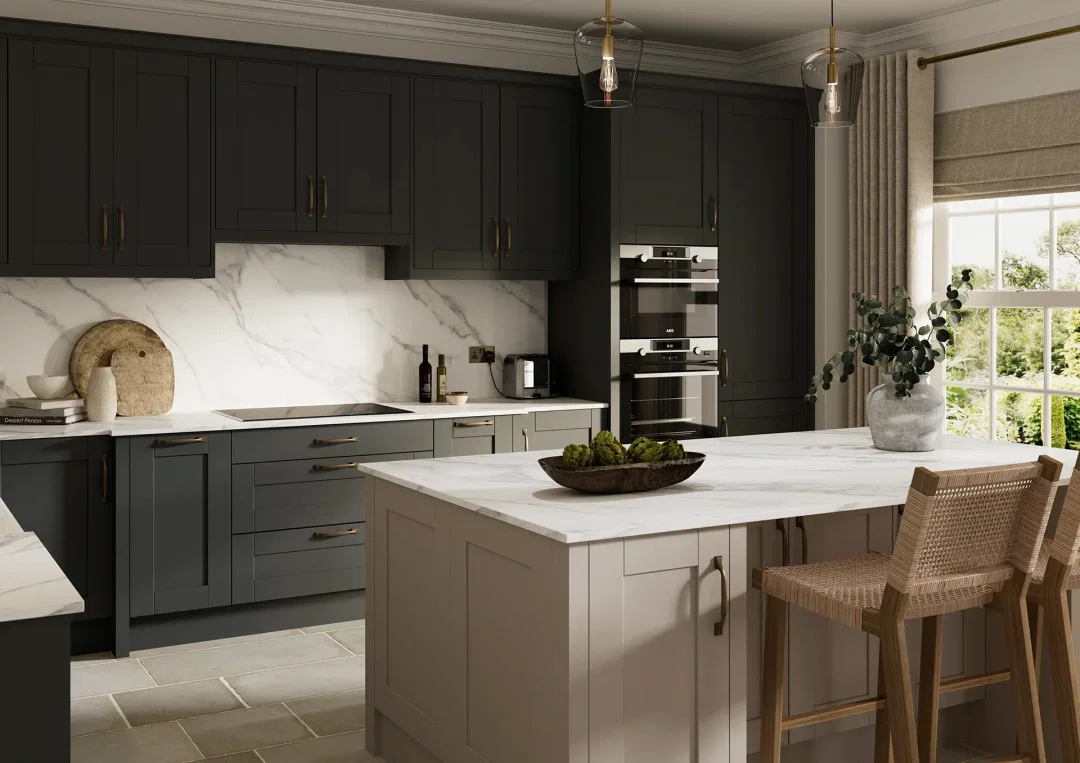
Kitchens that last are rarely rely on one flat colour. Layering colours adds depth without feeling busy. You might keep tall units lighter and ground the space with darker base units or introduce texture through an island or larder run. Take a look at our blue and green options such as Franklin’s Indigo Blue, Maine’s Reed Green or Hamilton’s Marone Casella Oak.
Worktops, handles and splashbacks should support the main colour choice, not compete with it. You can keep things cohesive by complementing the door colour or add contrast if you want certain details to stand out.
Finish affects how colour behaves once life gets involved. Matt finishes soften light and are forgiving when fingerprints appear after a busy morning. Gloss reflects light and can lift smaller spaces, but you’ll notice marks sooner. If you’re drawn to a gloss finish, our flat slab Hamilton range and Manhattan J Pull both offer a considered selection of sleek, modern options.
Painted doors feel warm and naturally lived in over time. Wrapped finishes cope better with knocks and moisture in kitchens that work hard all day. You feel the difference when the kitchen’s busy and everything still looks pulled together.

Timeless kitchen colours aren’t necessarily about playing it safe. They’re about choosing wisely. At some point, you stop comparing. You’re not second guessing or scrolling for alternatives. The colour feels right in the space and still feels good on an ordinary Tuesday night. That’s when a kitchen truly stands the test of time.
Let's talk kitchen. Made in Sussex, designed for real life, and built to fit how you cook, gather and live, every day.
Explore our kitchensSeen a similar kitchen for cheaper? We’ll match the price.

Service that just gets it right, every time.

We’ve been building kitchens a long time.

Made right here in our Sussex factory.