

Price Match Promise
Seen a similar kitchen for cheaper? We’ll match the price.
20% off stone worktops until 11th November* Find out more
Soft colours, calm spaces, and beautifully refined design.
Published
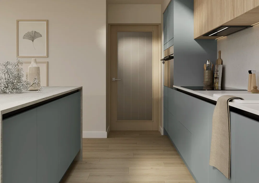
A pastel kitchen brings calm into the heart of the home. Gentle, chalky tones soften the space without draining it of character, creating kitchens that feel light, welcoming and effortlessly modern. It’s no surprise pastel kitchens continue to grow in popularity across the UK. These colours work just as well in compact spaces as they do in busy family homes.
What draws people in isn’t trend alone. It’s how these colours make the room feel.
Pastels sit comfortably between neutral and bold. They brighten a room naturally, which makes them especially useful in north facing or lower light kitchens. Shades like sage, powder blue, blush and muted lilac feel modern, but never stark.
You feel it as the day moves on. The kitchen feels fresh in the morning, relaxed at lunchtime and softly atmospheric in the evening. Pastels also pair easily with natural materials, timber textures, stone‑effect worktops and brushed metals, which helps the room feel layered rather than flat.

The most successful pastel kitchens are considered rather than colourful for colour’s sake. Soft greens feel grounding and calm. Powder blues bring freshness without feeling cold. Blush and muted lilac add warmth in a subtle, grown‑up way.
Two‑tone schemes work particularly well. Using a pastel shade on base units and keeping wall units lighter helps the room feel open, especially in smaller kitchens. It’s a simple way to add personality without overwhelming the space.
Many Paula Rosa Kitchens ranges are available in pastel tones, and palettes can be adjusted to suit how bold or restrained you want the look to feel.
Pastel kitchens shine when the rest of the room stays calm. Satin or soft matt finishes reflect light gently without glare. Worktops in premium laminate or quartz keep the palette grounded. Warm woods and textured tiles add depth.
You notice the difference when the kitchen’s being used properly. The colour holds its own without demanding attention. Accessories can change with the seasons, but the base always feels settled.
Handles in brass or soft black add definition, while chrome keeps things crisp and contemporary.

The best pastel kitchens don’t try to impress. They support everyday life quietly.
When the colour feels comfortable on an ordinary weekday, not just when the kitchen’s new, that’s when you know you’ve chosen well.
Let's talk kitchen. Made in Sussex, designed for real life, and built to fit how you cook, gather and live, every day.
Explore our kitchensSeen a similar kitchen for cheaper? We’ll match the price.

Service that just gets it right, every time.

We’ve been building kitchens a long time.

Made right here in our Sussex factory.