

Price Match Promise
Seen a similar kitchen for cheaper? We’ll match the price.
20% off stone worktops until 11th November* Find out more
Warm neutrals are defining kitchen design in 2026, offering colour that lives well beyond trends.
Published
Warm neutral kitchens are shaping design in 2026. After years of crisp white, cool grey and high‑shine finishes, homeowners are choosing colours that feel softer and more settled. Think cream, cashmere, taupe, mushroom, stone and clay. Shades that feel modern without feeling cold.
This shift isn’t just about colour. It reflects how kitchens are used now. They’re no longer just places to cook. They’re where people pause with a coffee, help with homework, answer emails, host friends and move through the day. Warm neutrals support that role by creating a backdrop that feels calm rather than clinical.
In bright, open‑plan homes, summer light can be strong. Brilliant white cabinetry can feel harsh, while darker colours sometimes absorb too much light. Warm neutrals sit comfortably in between.
You feel it across the day. Fresh and light in the morning. Comfortable at lunchtime. Softer and more atmospheric in the evening. These tones also pair naturally with wood, stone, linen, ceramic and brushed metals, helping the kitchen feel connected to the rest of the home, especially when doors are open and the garden becomes part of daily life.
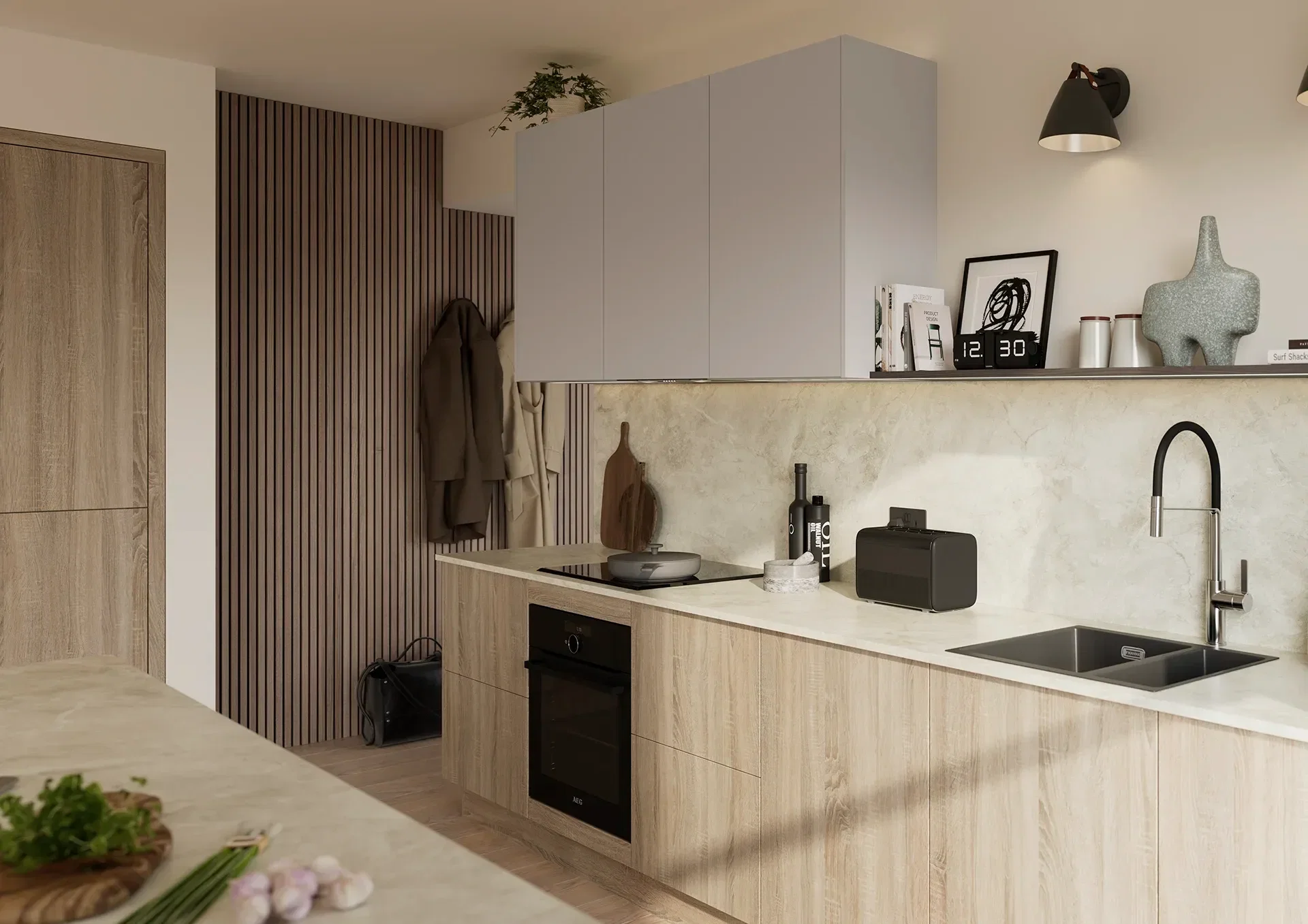
The most successful warm neutral kitchens rely on layering, not a single flat colour. Similar tones work best when they’re combined with different textures.
A cream cabinet gains depth next to a stone‑effect worktop. Cashmere feels richer with darker handles. Taupe base units feel grounded when paired with lighter wall units. These small contrasts stop the kitchen feeling bland, while keeping the overall look calm.
Ranges like Fishbourne, with its classic Shaker detailing and warm, woody character, work particularly well here. The structure adds interest, while the colour palette keeps things soft and welcoming.

Texture does the work that colour alone can’t. Woodgrain, matt finishes and stone‑effect surfaces add depth without visual noise.
You notice it when the kitchen’s being used properly. Light moves across a matt door. A timber accent softens the room. Surfaces feel forgiving rather than precious. The kitchen still looks pulled together without demanding attention.
Warm neutrals aren’t just a trend for 2026. They last because they adapt. A cream or mushroom kitchen can be refreshed over time with new lighting, handles, tiles or accessories, without needing a full redesign.
When a kitchen feels settled now and flexible for later, it’s usually a sign the colour choice was right.


Seen a similar kitchen for cheaper? We’ll match the price.

Service that just gets it right, every time.

We’ve been building kitchens a long time.

Made right here in our Sussex factory.